Wednesday, December 31, 2008

Speaking of Chris Khalaf...

Aparo fans should check for a back issue copy of Image's Big Bang Comics #20, featuring Chris's tribute to the legendary Haney/Aparo team with "The Free and the Brave", teaming up the Knight Watchmen and the Blitz!
Chris wrote and drew this Brave and Bold homage in an impressively authentic Aparo style, as well as lots of Haney hallmarks in the script and plot. (Chris happens to be a really terrific artist, who expressed some dismay about having his big league debut in an Image comic, of all things! We were both a bit snobby about those upstarts back then.)

Aparo, Orlando, and Andru--Together!

Back in 1992, when Chris Khalaf and I first revived the Jim Aparo Fan Club and began publishing our Newsletter, Chris lamented that he wished he had bought a "young readers" Batman book that featured art by Jim Aparo inked by Joe Orlando (his old Phantom Stranger and Spectre editor!). Chris couldn't remember the details of the book, which is surprising given his astounding skills at recall in the world of comics, but I knew it was something I had to look out for; after all, I've always aimed at amassing a complete Aparo collection. About 5 years ago, I found the book Chris had remembered. I stumbled upon it at an antique store, marked at $3.00.
It's this:

"The Case of the Laughing Sphinx", written by Andy Helfer, and illustrated by Ross Andru, Jim Aparo, and Joe Orlando. It's a hardback, heavily illustrated book that originally came with a cassette tape, presumably with a reading/dramatization of the story (several familiar names from DC are listed in the voice credits).
Chris hadn't remembered Ross Andru's contribution, which was obviously the layouts. I've got a lot of love for Ross, but I've never liked the layouts he produced for other artists. Aparo pencilled from his layouts for many covers, including Detective Comics in its "Dollar Comic" era. I can spot Andru's hand most easily by looking at the legs: Ross seems to have believed that a dynamic cover required knees bent at rather extreme angles. Batman's bended knee here is not too bad, but some of the squats that Aparo had to draw on those 'TEC covers were pretty awful looking.


How about the interiors? Here's a sample for you all:

Tuesday, December 30, 2008

Spectre Fill-in Pencillers

Recent discussion of Aparo on the Classic Comics Forum at www.comicbookresources.com reflects a reasonably popular opinion that Jim Aparo's work on The Spectre (in Adventure Comics #431-440) was his best work. The opinion certainly has its merits, but one should note that this run of issues is not actually pure Aparo art. In two episodes, a couple of unexpected fill-in artists provide pencil art which Aparo inked (but did not letter). I've never been fully happy with either of these installments; while Aparo's finishes do provide a consistency with the other issues, the page design is strikingly unlike Jim's usual work, with detrimental effects.
First up, veteran artist Frank Thorne contributes the pencils for issue 434, "The Nightmare Dummies and...The Spectre!". Let's have a quick look:

Well, this page doesn't look too bad, but I don't like the framing in that top tier. The visual flow in the entire issue is awkward, although Thorne's actual renderings are, typically, just fine.

Interestingly, Thorne gets to illustrate the apartment of Spectre's alter ego Jim Corrigan in this issue. When Aparo returns to the set a few issues later, in a solo-drawn installment, he faithfully recreates the furnishings and decor that Thorne established in 434. Very nice bit of set continuity, and quite unexpected.

Note also that Thorne essentially co-pencilled the cover, which faithfully recreates a scene from the interior. Sharp eyes will discern the Thorne-like qualities of the almost-headless animated dummy.


Now let's have a look at issue 438, "The Spectre Haunts the Museum of Fear". Editor Joe Orlando tasked DC's Bronze Age mainstay Ernie Chua (a.k.a. Ernie Chan) with the pencils for this installment.
Um...to put it tactfully, I was never a big fan of Chan's work. It had many of the characteristic techniques common to the many artists recruited from the Phillipines in the 1970's, without the flair that I admired in artists like Nestor Redondo, Alfredo Alcala, or Tony deZuniga, nor the quirks of guys like Gerry Talaoc or Rico Rival. Chan's work usually struck me as stiff and posed and unauthentic. His rendering of clothing is unconvincing here, and his expressions of action are, here at least, undynamic.

All in all, both jobs are perfectly adequate for the standards of the time, but for me, they somewhat spoil a memorable run.

Monday, December 29, 2008

Unpublished Pencils

Back in the early 90's, Jim sent me a note updating me on his assignments. One of them was an inventory issue of Detective Comics, featuring Batman and Robin, during the period when the "real" Batman was out of commission (Aparo noted that his story featured the legit Bruce Wayne). The story was never published. In fact, it may never even have been inked. But here's a page of Jim's pencils (back then, DC was having someone else ink his work).

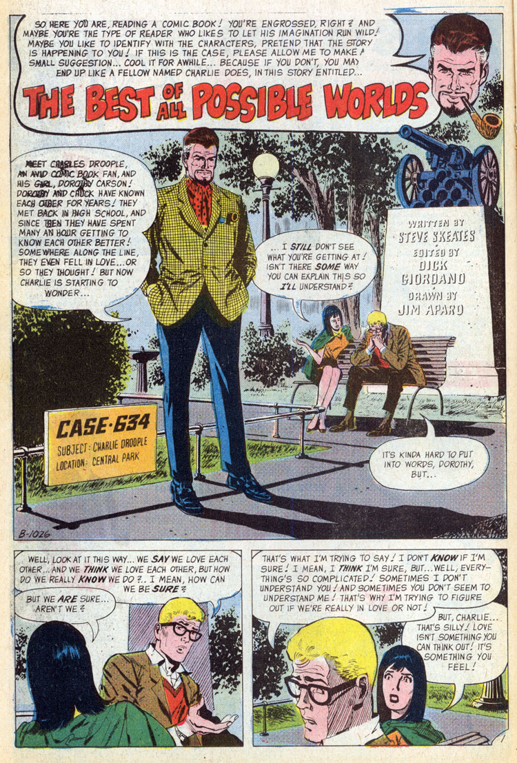
Charlie Droople!


seductionoftheindifferent.blogspot.com directs us to Fred Hembeck's posting of the Charlton classic "The Best of All Possible Worlds" on Fred Hembeck's site. This remarkable metatextual story made its first unlikely appearance in an issue of Many Ghosts of Dr. Graves, and was written by Aparo's frequent late-60's collaborator Steve Skeates. There's never been anything like this printed in mainstream comics, and many who read it immediately declare it an all-time favorite. I will resist saying anything to spoil it. Just read it, now.

Savograns!

My pal Mac, a.k.a. Comic Book Resources forum member Red Oak Kid forwards this treasure from Jim Aparo's early career in advertising: a spot from an 1965 issue of Popular Science:
Trained eyes will recognize that even then, Jim was doing his own lettering. You might recognize the cartoony style from Aparo's first published comic book work, Miss Bikini Luv in Charlton's Go-Go comic book. He had few chances to revisit this sort of drawing for the remainder of his career.

UPDATE: I've confirmed that a series of Aparo ads for various Savogran products appeared throughout 1965 issues of Popular Science! The earliest ones are unsigned, but are definitely Jim's (with his distinctive lettering), and they are replaced in 1966 by generic ads with photos of the product containers rather than cartoon panels. I'll post the entire set as soon as I get the time to photocopy them from the bound editions at the library (and the time to scour each issue more carefully, so that I can be certain to have the entire set...at least the entire set that was published in this magazine).